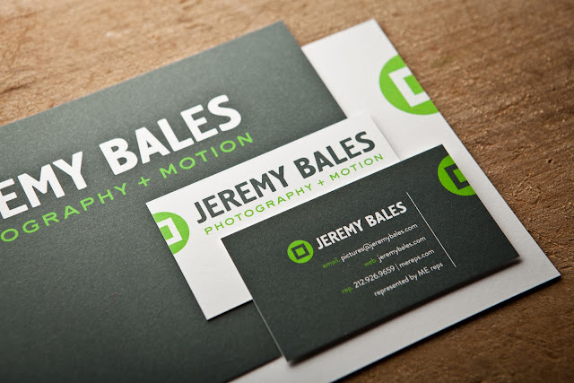
I knew that brand was important because I had read and heard it at least a hundred times. I had certain vague ideas about what my business's identity should be. But, that usually landed me in a convoluted mess of symbolism and impossible-to-get metaphor.

I would love it if my office was in a converted Airstream pulled by a restored '77 El Camino to assignments where I'd shoot with an old range finder and file with carrier pigeons. I'm not there yet, but more importantly, neither is the work.
I decided to work with a designer. Crazy, huh? Amber Luke took my nutty visions and the actual work that I'm doing and gave me something that I wasn't expecting. The type was big and bold with a colorful icon. We revised to simplify the icon (I'm still a fan of symbolism). And that was it: a logo that looked like it belonged on my work. Like a fiery brand.


No comments:
Post a Comment